What actually makes a summer table unforgettable in 2026? Is it the color, the setting, or that effortless feeling guests can’t quite explain? In this guide to Summer Tablescape Ideas Dinner Party 2026, I’ll walk you through bright, colorful, and surprisingly easy ways to transform both indoor and outdoor dining into something that feels fresh, personal, and completely on-trend.
Lemon Yellow Table
I always start summer with a Lemon palette because it instantly sets a bright, uplifting tone. For this look, I imagine a sunlit outdoor terrace or even a relaxed dining room with large windows. A wooden or round table becomes the base, layered with crisp white linen and pops of citrus yellow that feel clean rather than overwhelming. This style works beautifully for both casual brunches and late afternoon dinners.
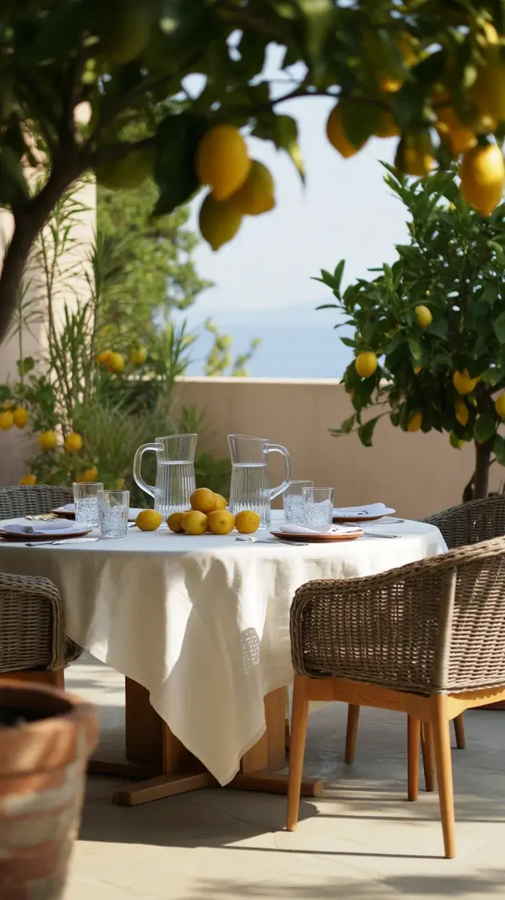
I like to build this tablescape with lemon-patterned plates, light ceramic serveware, and clear glass pitchers filled with lemon water or sprigs of mint. Wicker chairs or light oak seating enhance the Euro summer vibe, while linen napkins tied with twine add that simple but thoughtful touch. Fresh lemons scattered across the table act as both decor and conversation starters.
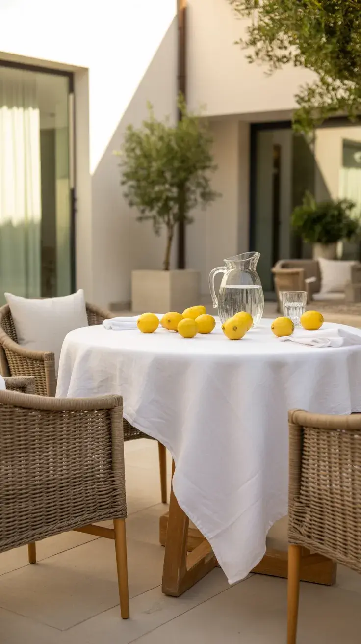
Personally, I’ve found this setup incredibly easy to recreate, even on a budget. Many designers, including features in lifestyle magazines like Architectural Digest, emphasize using fruit as decor because it feels organic and unforced. I love how this look balances polish with a relaxed, casual charm.
What’s missing here is layered lighting for evening transitions. I would add small glass lanterns or soft string lights to make the table feel just as magical after sunset.
Blue White Table
There’s something timeless about a Blue and white palette, especially when I want a refined yet relaxed summer setting. I usually picture this tablescape in a breezy indoor space or a shaded patio, inspired by Italian coastal homes. The contrast between deep blue and crisp white feels clean, classic, and effortlessly elegant.
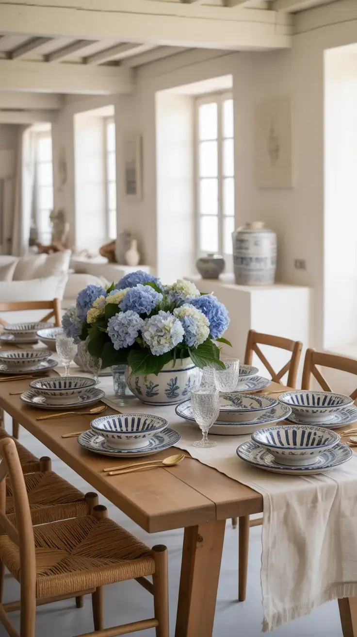
I build this look with porcelain plates, striped or floral patterns, and linen runners. A ceramic vase with white hydrangeas anchors the table, while woven placemats soften the overall feel. I often mix patterns here because it adds depth without making the design feel busy. Wooden or painted chairs complete the look, reinforcing that relaxed Mediterranean mood.
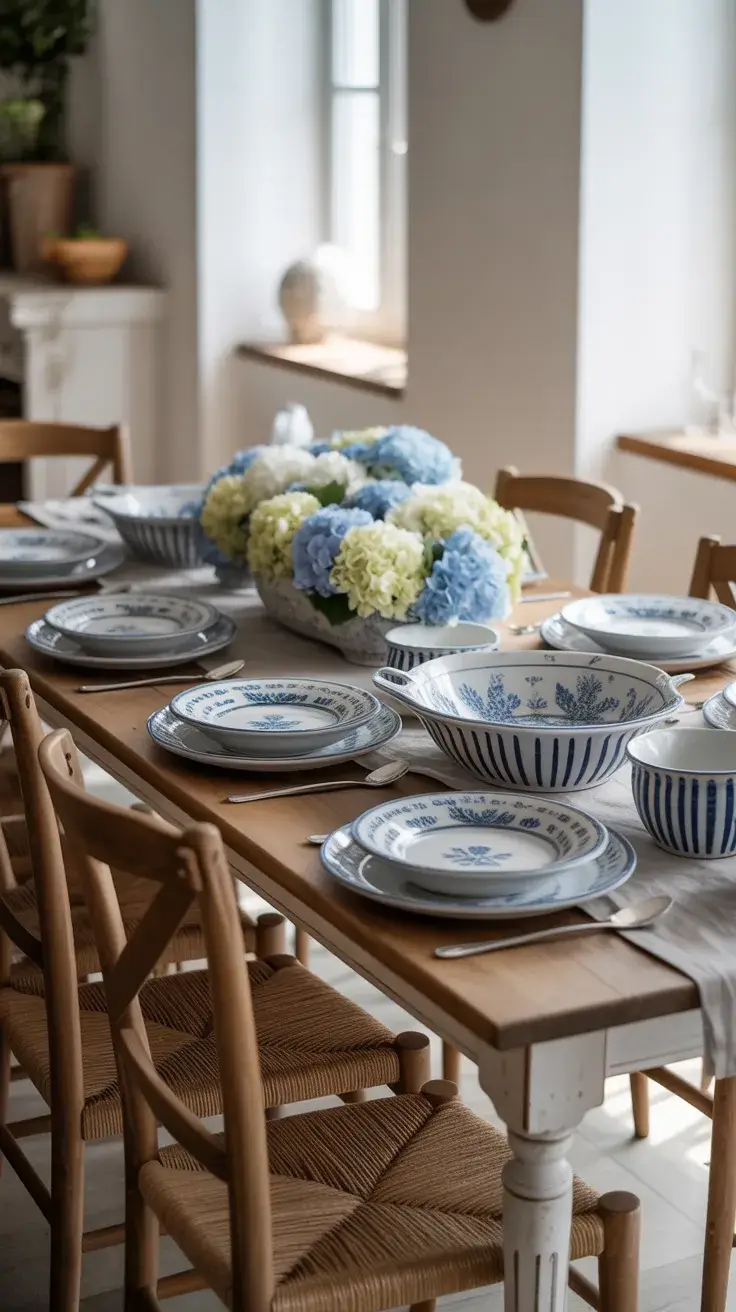
In my experience, this is one of the most versatile ideas for summer hosting. It transitions beautifully from a casual lunch to a more formal dinner. Designers often recommend sticking to a tight color palette like this to avoid visual clutter, and I completely agree—it keeps everything cohesive.
To elevate this setup further, I would add subtle metallic accents like brushed silver cutlery or candle holders to introduce a hint of sophistication without breaking the palette.
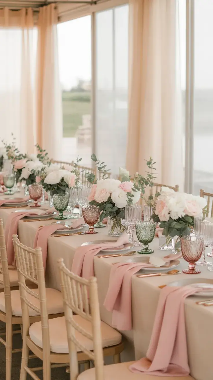
Blush Pink Table
A Pink tablescape instantly softens the atmosphere, making it perfect for intimate gatherings or even a small wedding dinner. I like to set this in a light-filled dining room or garden space where natural light enhances the blush tones. The overall effect feels romantic but still modern.
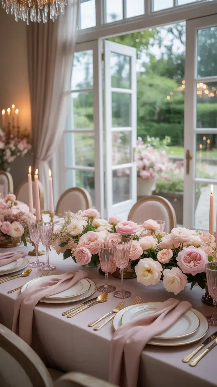
I layer different shades of pink through table linens, glassware, and florals—roses, peonies, or even wildflowers. Clear or gold-rimmed plates keep the setting from feeling too heavy, while upholstered chairs or cushions add comfort and elegance. I always include candles here because they amplify the softness of the palette.
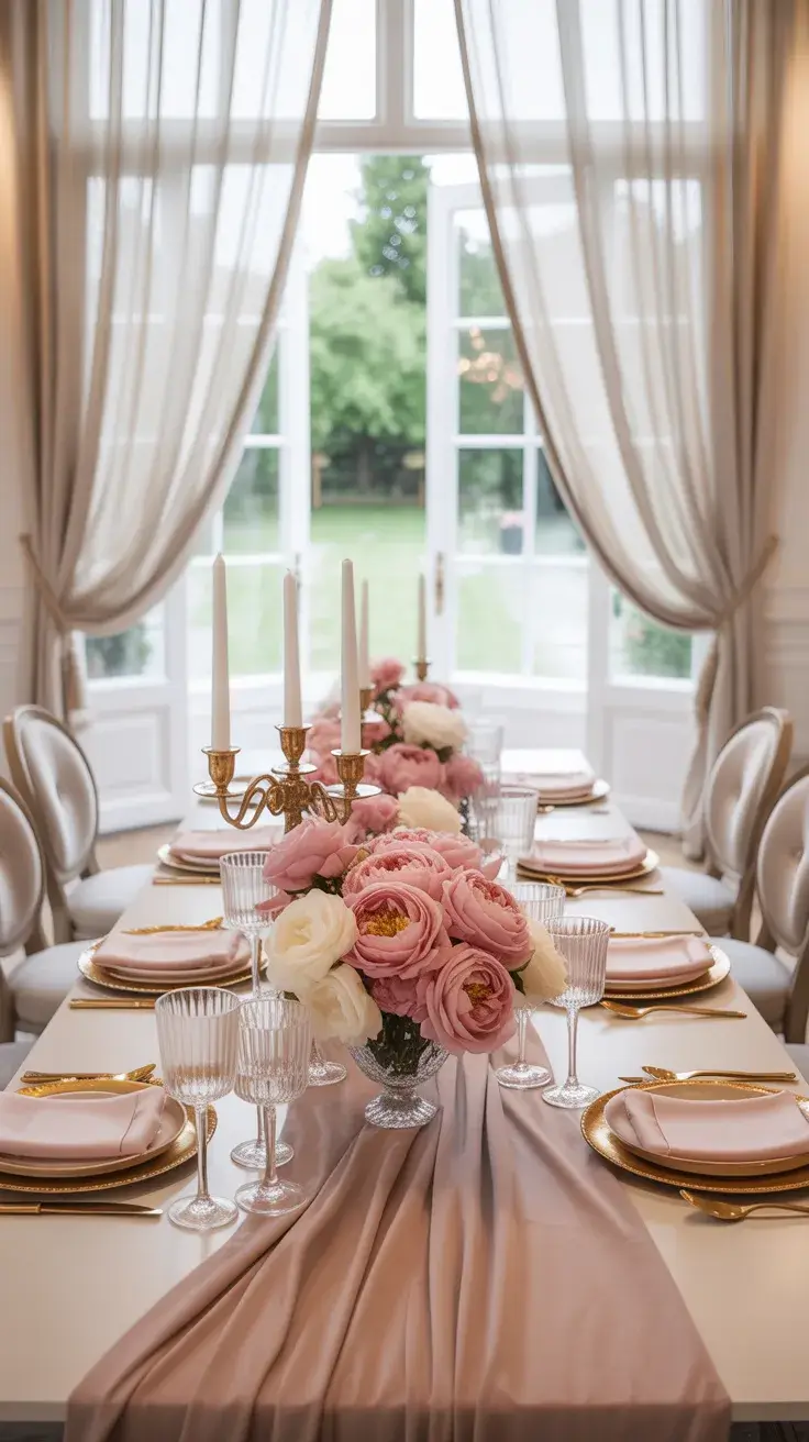
From my perspective, the key to making pink feel grown-up is balance. Too much can feel overwhelming, but when paired with neutrals or soft metallics, it becomes incredibly chic. I’ve seen this approach highlighted in Elle Decor, where they emphasize tonal layering for depth.
What I would add here is a contrasting element—perhaps a touch of greenery or even subtle blue accents—to prevent the palette from becoming too monochromatic.
Deep Green Table
A Green tablescape feels grounded and refreshing, especially for outdoor dining. I often design this look for garden settings, where the table blends seamlessly with the surrounding nature. The result is calm, organic, and slightly sophisticated.
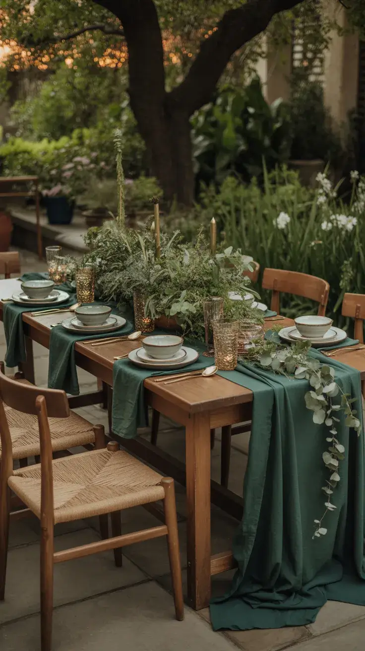
I use dark green linens or runners as a base, paired with natural wood furniture. Ceramic plates in earthy tones, linen napkins, and simple glassware keep the look cohesive. Adding herbs like rosemary or eucalyptus as centerpieces not only looks beautiful but also introduces a subtle fragrance.
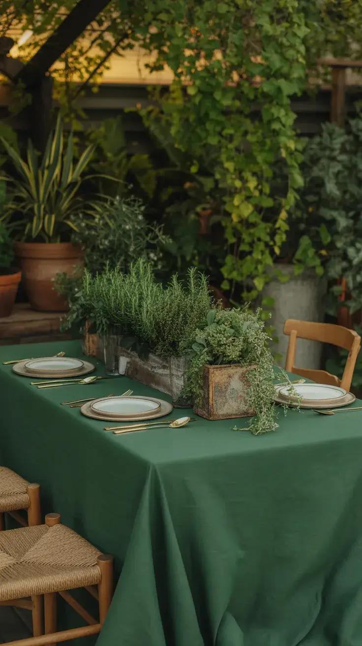
In my own hosting experience, this style feels incredibly welcoming. It’s less about perfection and more about connection. Designers often talk about biophilic design—bringing nature into your space—and this tablescape does exactly that.
To complete the look, I would incorporate layered textures like woven chargers or stone elements to add dimension and visual interest.
Coastal Neutral Table
For a relaxed Coastal vibe, I lean into soft neutrals and natural textures. This tablescape works beautifully for outdoor settings near water or even for recreating that feeling at home. The palette is calm, airy, and timeless.
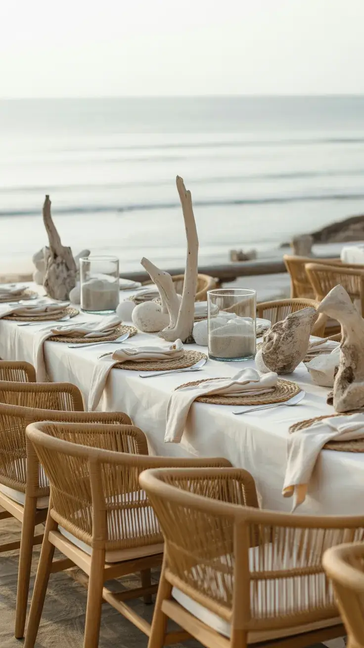
I build this look with beige linens, driftwood accents, and light ceramic dishes. Rattan chairs or benches add texture, while glass vases filled with sand or shells subtly reinforce the theme. The key here is restraint—nothing should feel overly styled.
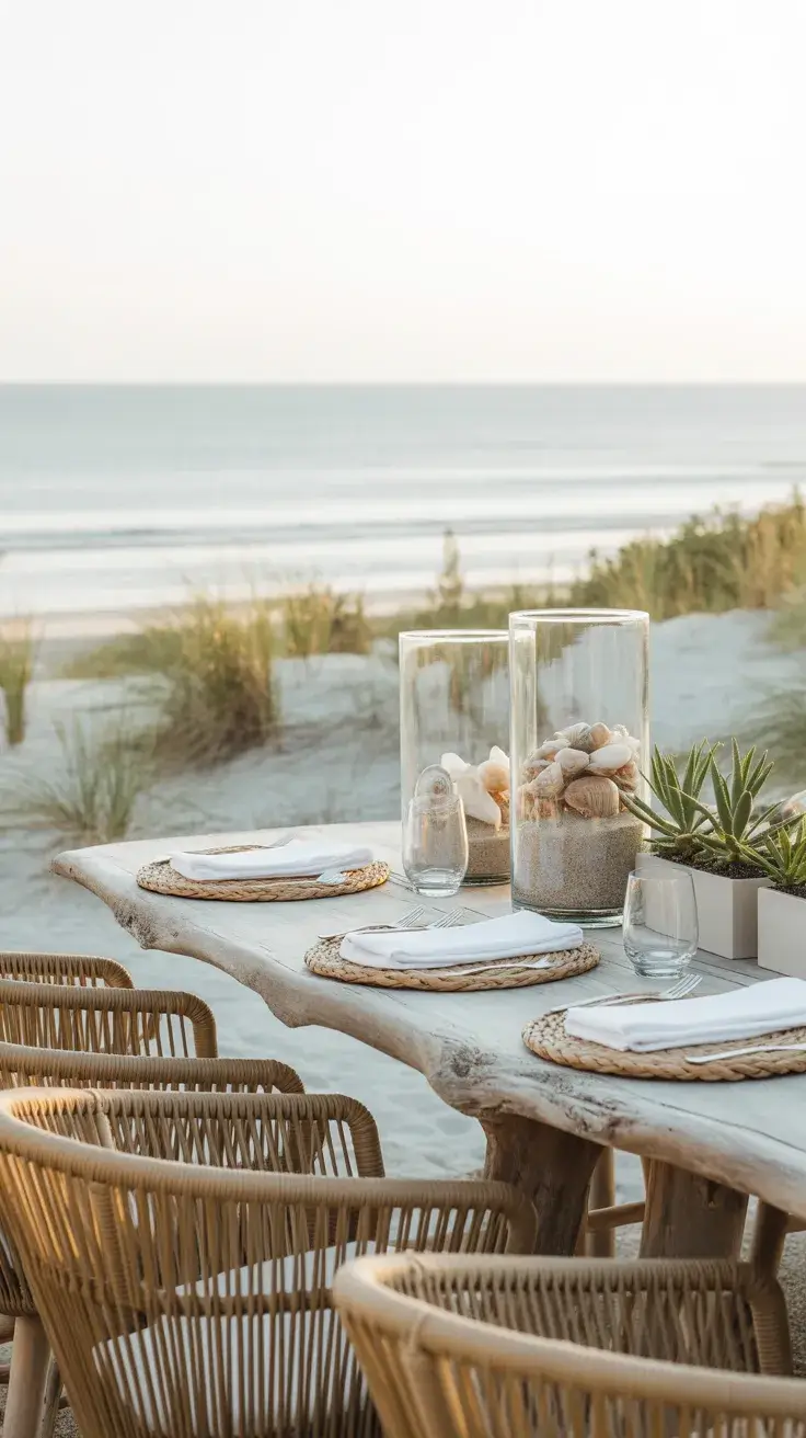
I personally love how this setup creates an instant sense of escape. It reminds me of summer holidays, and that emotional connection makes guests feel more relaxed. Many designers recommend neutral palettes for longevity, and this is a perfect example.
To enhance this tablescape, I would add soft blue accents to gently tie in the coastal theme without overpowering the neutral base.
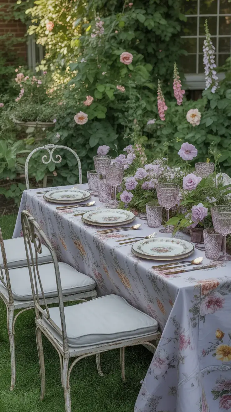
Lavender Sage Table
This combination of lavender and sage feels fresh, slightly unexpected, and very current for 2026. I like to use this palette in both indoor and outdoor dining spaces because it adapts beautifully to different environments.
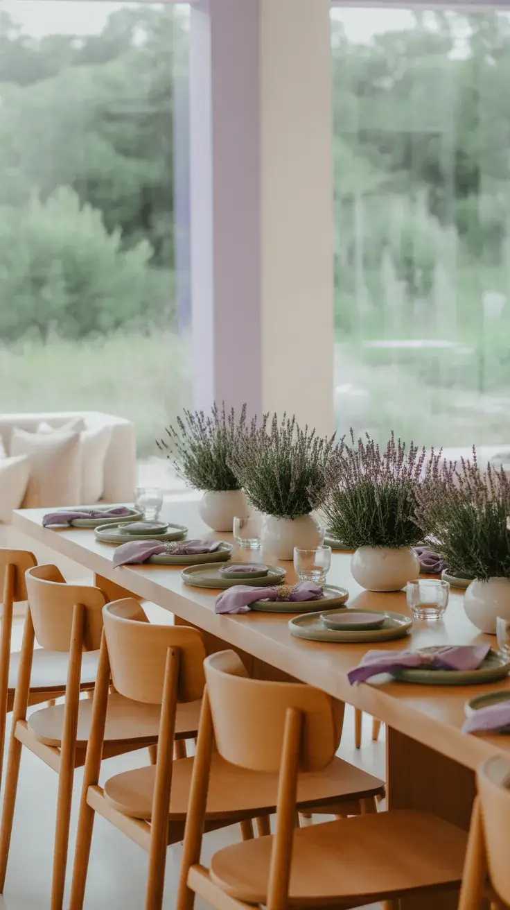
I combine soft purple linens with muted green foliage, using ceramic plates and matte finishes to keep the look modern. Wooden furniture or painted chairs in soft tones enhance the overall harmony. Fresh lavender bundles double as decor and subtle fragrance.
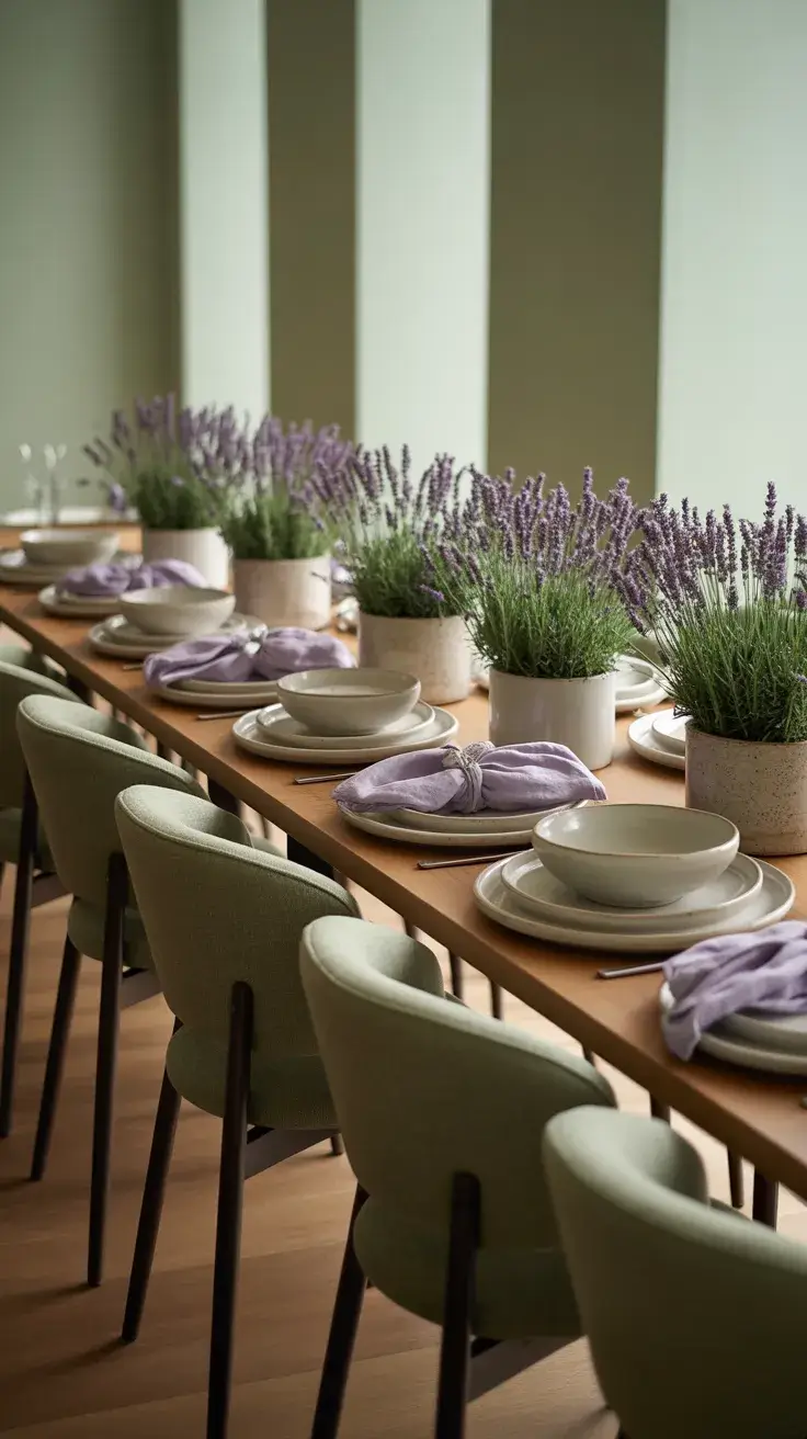
From my experience, this tablescape feels calming and elevated at the same time. It’s a great option when you want something unique but still approachable. Designers often highlight muted color pairings as a way to create sophistication without excess.
What I would add is layered lighting—candles or soft bulbs—to bring warmth and depth, especially for evening gatherings.
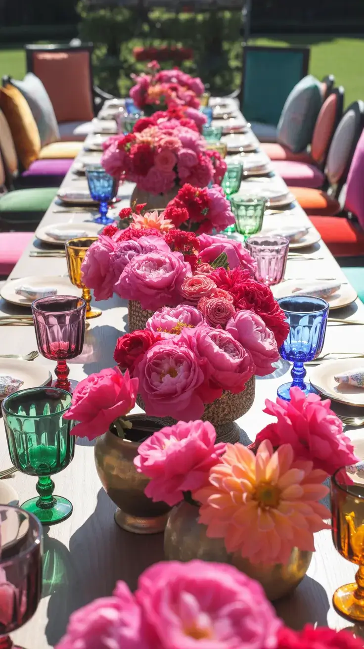
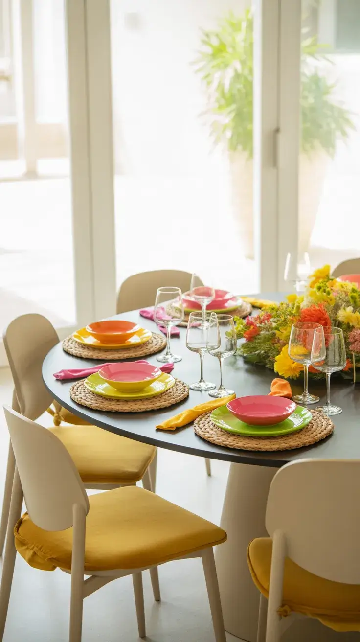
Orange Fuchsia Table
If I want energy and boldness, I go for an orange and fuchsia palette. This is one of the most colorful and expressive ideas for a summer table, perfect for lively parties or celebrations. I usually set this up in a bright outdoor space where the colors can truly shine.
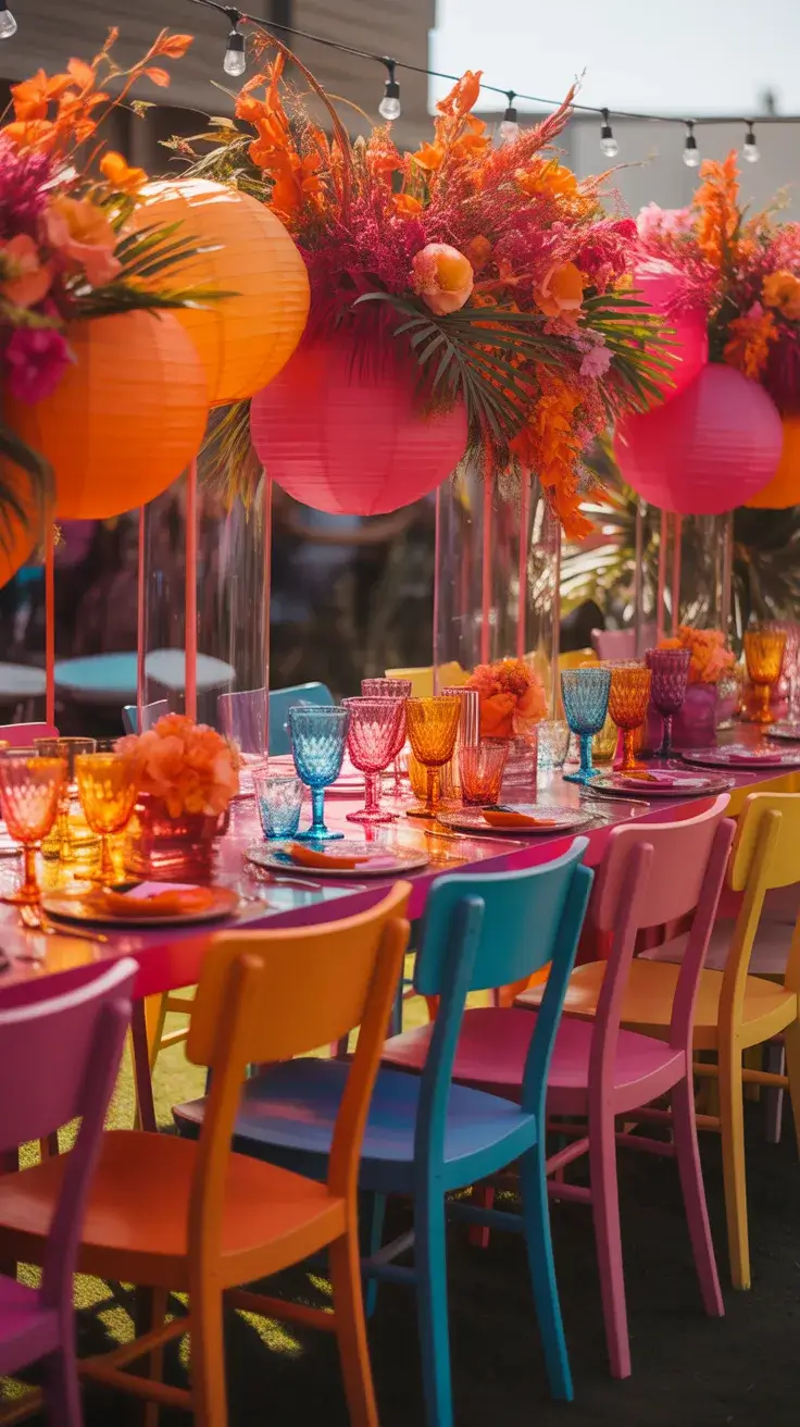
I mix vibrant linens, bold floral arrangements, and playful glassware. Chairs can be mismatched or painted for a more eclectic feel. Gold accents or patterned plates help tie everything together without competing with the colors.
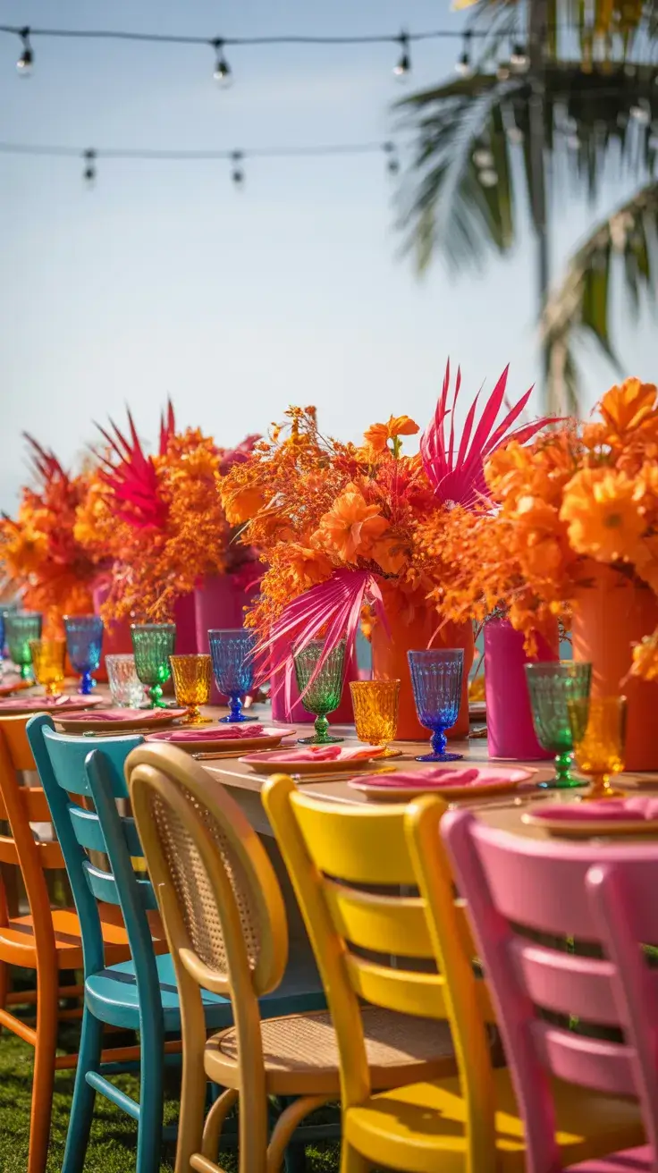
In my opinion, this is where you can really have fun. It’s less about rules and more about personality. I’ve seen similar bold palettes featured in modern design editorials, encouraging hosts to embrace color confidently.
To refine this look, I would introduce a grounding element—perhaps neutral tableware or a simple runner—to balance the intensity of the colors.
White Wood Table
I often turn to a White wood tablescape when I want something that feels clean, airy, and effortlessly simple. This setup works beautifully in both an indoor dining room and a covered outdoor patio, where natural light enhances the soft tones. A whitewashed or light oak table sets the foundation, creating a calm backdrop that allows every detail to breathe.
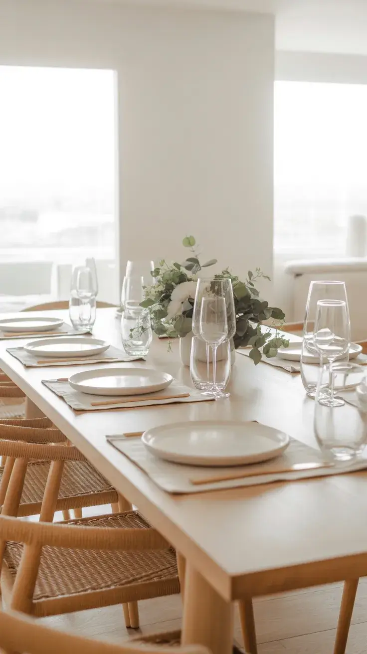
I build this look with neutral linens, white ceramic plates, and clear glassware. Light wooden or rattan chairs add warmth, while subtle greenery—like olive branches or eucalyptus—keeps the table from feeling too minimal. I prefer layering textures here rather than colors, using woven placemats or linen napkins to add quiet depth.
From my experience, this is one of the most easy and reliable ideas for hosting. It never feels overdone, and it adapts to any occasion, from a casual lunch to a more refined dinner. Designers often emphasize that neutral palettes create a sense of calm, and I’ve found that guests truly relax in this kind of setting.
What I would add is a focal point—perhaps a sculptural centerpiece or a statement light fixture—to give the table a bit more personality without disrupting its simplicity.
Vintage Floral Table
A Vintage floral tablescape brings softness and nostalgia into a summer setting. I usually imagine this look in a garden or a sunlit indoor space, where delicate patterns feel right at home. It’s especially beautiful for intimate gatherings or even a relaxed wedding brunch.
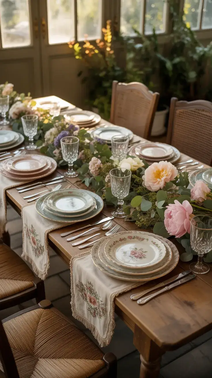
I mix floral china, embroidered linens, and soft pastel tones to create a layered, collected feel. Mismatched plates and antique-style glassware add character, while fresh flowers—roses, daisies, or wildflowers—tie everything together. Wooden or painted chairs enhance the charm, giving the table a slightly rustic edge.
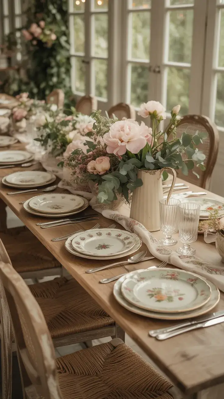
Personally, I love how this style tells a story. It reminds me of summer afternoons and family gatherings. Many design editors highlight the return of vintage-inspired decor, especially when it’s balanced with modern simplicity to avoid feeling outdated.
To complete this tablescape, I would include a few contemporary elements—like sleek cutlery or minimalist candle holders—to keep the look fresh and relevant for 2026.
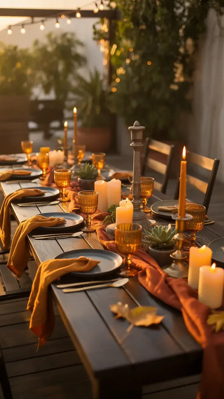
Terracotta Red Table
A terracotta and red palette instantly brings warmth and an Italian summer feel to the table. I often use this setup for outdoor dining, especially during late afternoon or sunset dinners. The earthy tones create a cozy yet vibrant atmosphere.
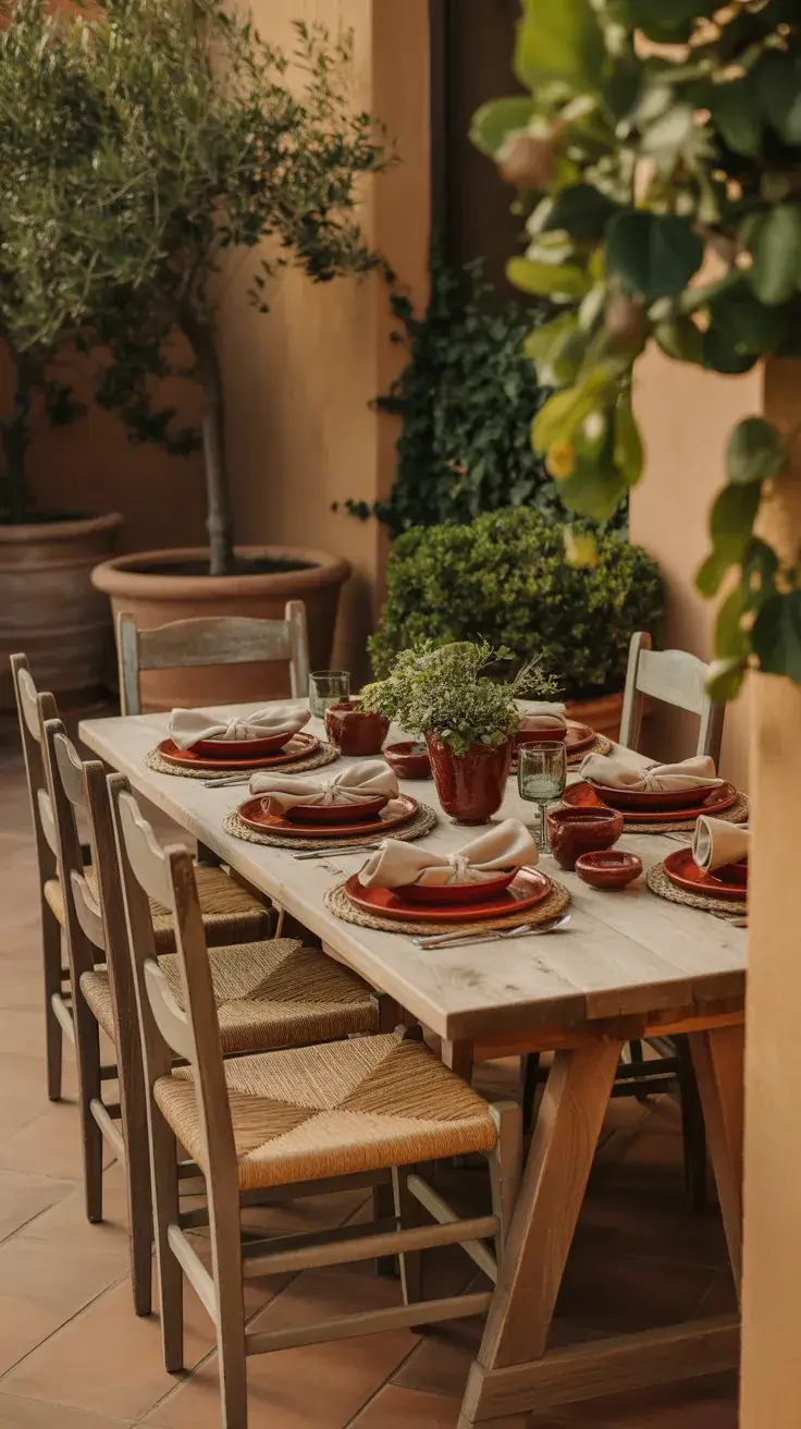
I layer terracotta plates, warm-toned linens, and rustic ceramics. Wooden furniture or stone surfaces enhance the Mediterranean mood, while simple glassware keeps the table from feeling too heavy. Adding fresh herbs or small potted plants introduces a natural element that complements the palette.
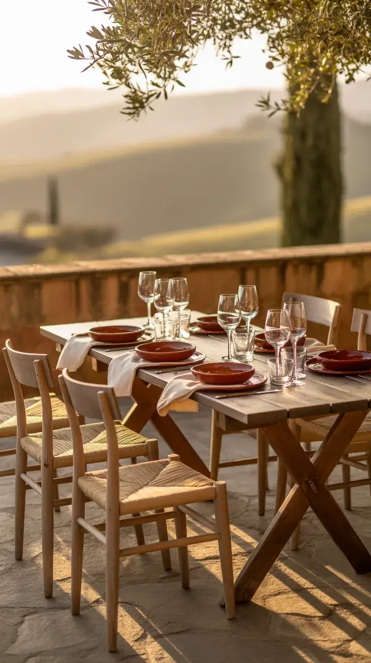
In my opinion, this is one of the most inviting setups. It encourages lingering conversations and relaxed meals. Designers frequently reference Mediterranean styling for its ability to feel both curated and effortless, and I completely agree with that balance.
What I would add here is soft lighting—candles or lanterns—to deepen the ambiance as the evening progresses.
Indigo Mood Table
For a more dramatic take on summer, I like to create a Moody tablescape using deep indigo tones. This works especially well for evening indoor dinners or shaded terraces where the lighting can enhance the depth of the colors.
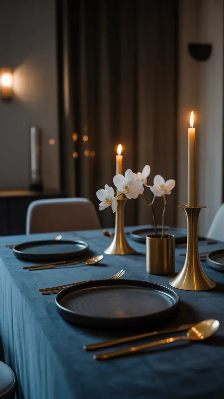
I use dark blue linens, ceramic plates, and matte finishes to build a rich foundation. Metallic accents—like brass or gold—add contrast, while minimal floral arrangements keep the look refined. Upholstered chairs or darker wood furniture complete the atmosphere.
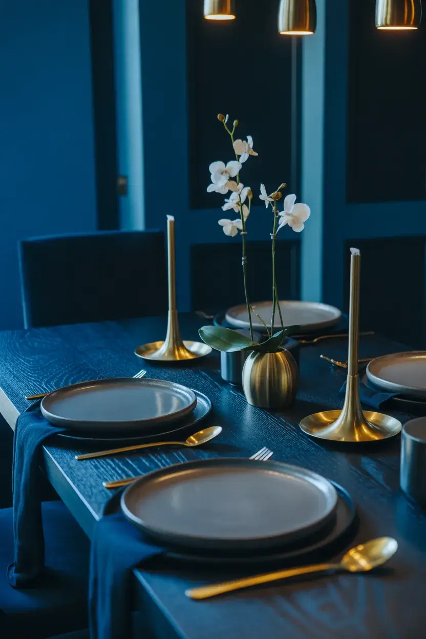
From my experience, this style feels sophisticated without being overly formal. It’s perfect when you want something different from the typical bright summer palette. Many designers recommend incorporating darker tones to create balance and visual interest, even in warmer seasons.
To elevate this look further, I would add layered lighting—candles, dimmable fixtures, or even subtle LED accents—to enhance the moody effect.
Blue Stripe Table
A Blue stripe tablescape feels fresh, playful, and slightly nautical, making it perfect for both coastal and city settings. I often use this look for outdoor lunches or relaxed dinners where I want something visually interesting but still approachable.
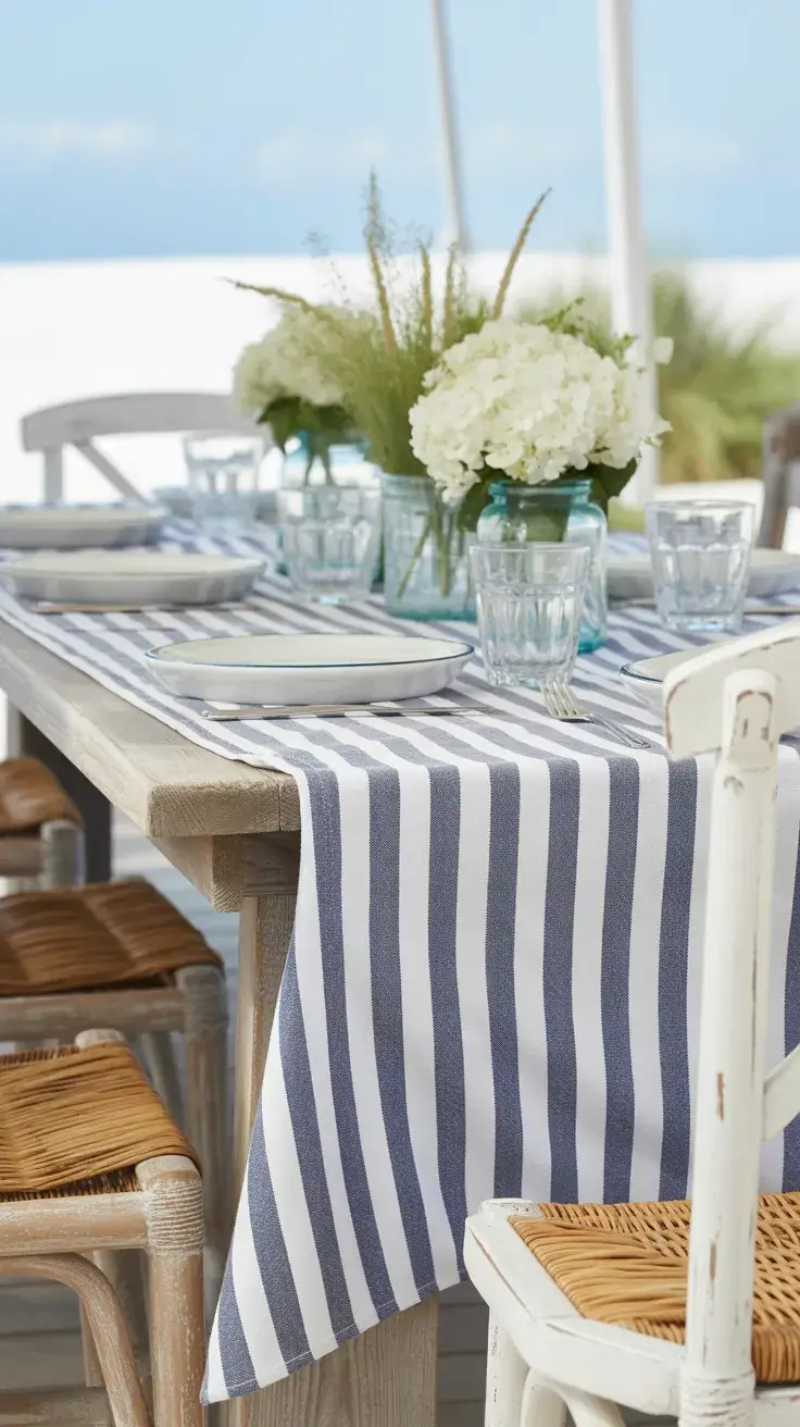
I incorporate striped linens, white plates, and simple glassware to keep the design clean. Wooden or white-painted chairs complement the palette, while small floral arrangements add a touch of softness. The stripes themselves become the main decorative element, so I keep everything else understated.
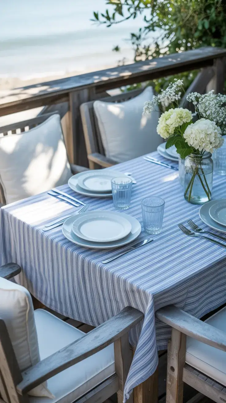
Personally, I find this to be one of the most versatile ideas. It’s easy to recreate and works across different styles, from casual to slightly more polished. Designers often highlight stripes as a timeless pattern that adds movement without overwhelming a space.
What I would add is a subtle contrast—perhaps a hint of pink or greenery—to break up the repetition and add dimension.
Pink Red Table
Combining Pink and red creates a bold, expressive tablescape that feels modern and confident. I like to use this palette for lively summer gatherings, especially in an outdoor setting where the colors can fully come alive.
I mix vibrant linens, layered plates, and bold floral arrangements. Clear or tinted glassware adds depth, while gold or brass accents help unify the look. Seating can be playful—think mixed chairs or cushions—to reinforce the energetic vibe.
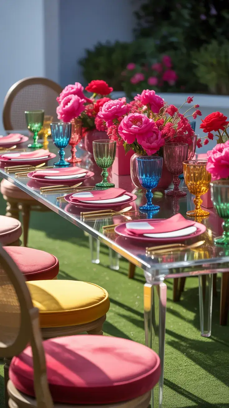
In my experience, this setup instantly lifts the mood. It’s perfect for celebrations where you want guests to feel energized and inspired. Many contemporary designers are embracing bold color pairings like this, encouraging more freedom in styling.
To refine the look, I would introduce a neutral base element—like a light table or simple runner—to keep the composition balanced.
English Garden Table
An England-inspired garden table feels timeless, romantic, and slightly whimsical. I imagine this setup in a lush garden or a bright outdoor space filled with greenery and flowers. It’s ideal for afternoon tea or a relaxed dinner.
I use floral linens, delicate china, and soft pastel tones to create a layered look. Wooden or wrought iron furniture enhances the classic garden feel, while fresh flowers—arranged loosely—bring the table to life. Adding small details like ribbon-tied napkins or vintage-inspired glassware completes the scene.
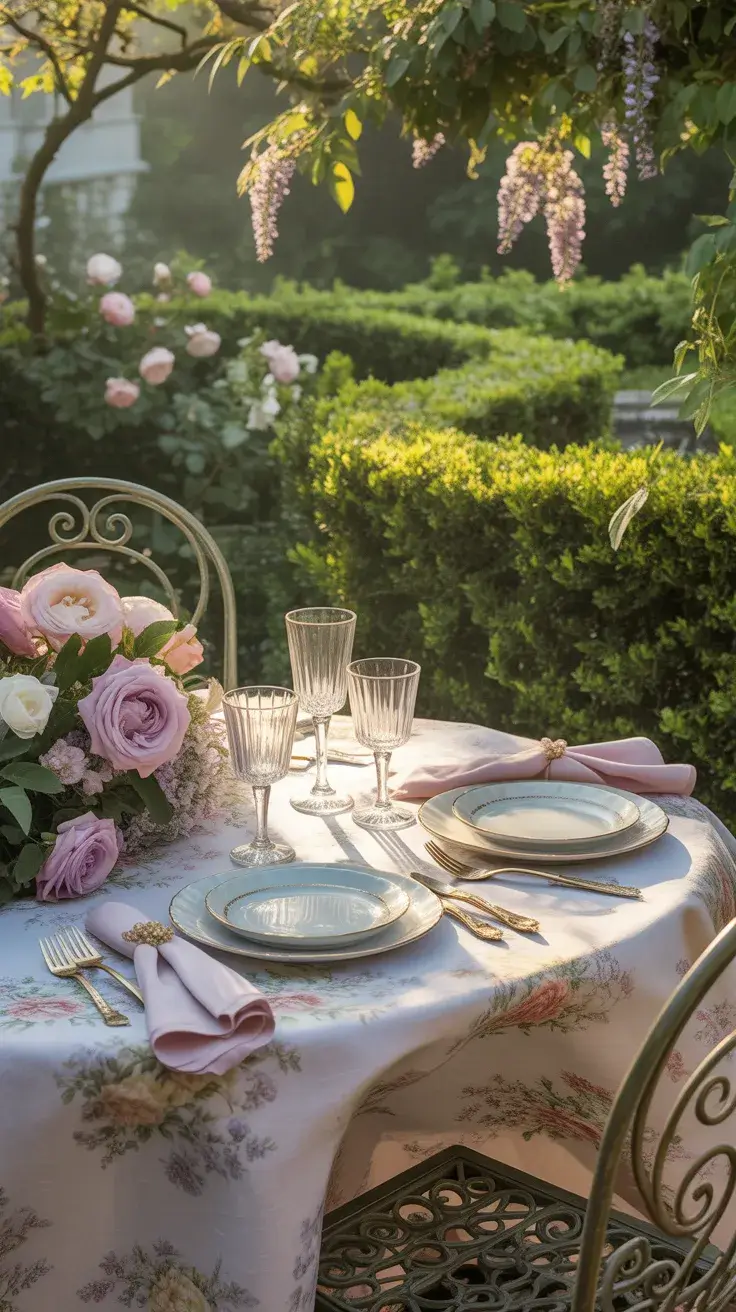
Personally, I love how this tablescape feels both elegant and approachable. It invites guests to slow down and enjoy the moment. Designers often reference English garden styling for its balance of structure and natural beauty, and I find that it translates beautifully to modern hosting.
What I would add is subtle lighting—string lights or lanterns—to extend the experience into the evening without losing the softness of the design.
Bright Color Table
I love starting summer with a Bright and unapologetically Colorful table that instantly lifts the mood of the entire space. Whether I’m styling a Dining room or a shaded Outdoor terrace, I lean into saturated hues layered in a way that still feels cohesive. This look works beautifully for a Casual dinner party because it doesn’t feel overdesigned, just joyful and inviting.
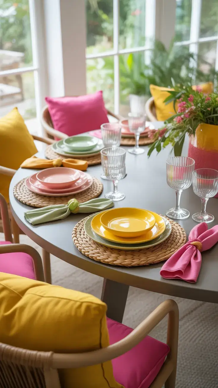
For this setup, I use a Round table to keep the energy social and fluid. I mix bold plates in coral or Pink with contrasting napkins, often in citrus tones like Lemon or soft Green. Clear glassware keeps it modern, while woven placemats ground the palette. Chairs can stay neutral, but I sometimes add colorful cushions to tie everything together.
Personally, I’ve found that this kind of table makes guests relax instantly. It reminds me of advice often shared in design features from Architectural Digest: color should feel lived-in, not staged. When everything looks a little imperfect, the experience becomes more memorable.
If I were refining this further, I would add a layered lighting plan for evening transitions, like portable lamps or string lights, to carry the vibrancy into a Late dinner setting.
Green White Table
A Green and white palette always feels like a breath of fresh air, especially for Outdoor dining. I use this combination when I want something that feels natural, grounded, and subtly elevated. It’s one of the most Simple yet effective ways to create a clean summer atmosphere.
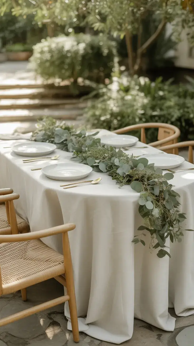
I usually start with a crisp white tablecloth, then layer in textured greenery, like eucalyptus runners or loose herbs. Plates stay classic, while napkins in soft sage or olive tones bring depth. Wooden chairs or rattan elements reinforce the organic feel, and ceramic serving pieces add a handcrafted touch.
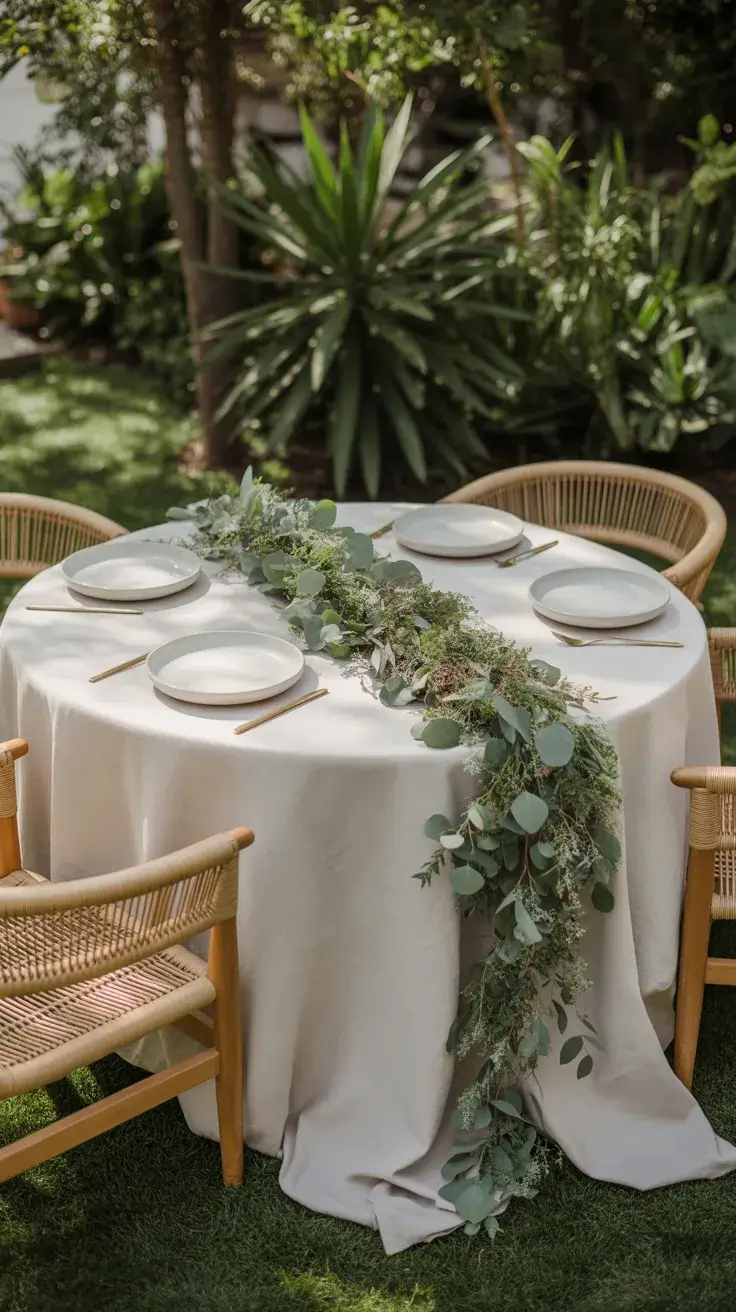
In my experience, this setup works beautifully for daytime gatherings. It feels calm but not boring. Designers often emphasize bringing nature into the table, and I’ve found that even a few fresh branches can transform the entire scene.
What’s missing here sometimes is contrast, so I like to introduce subtle metallic accents or glass details to prevent the palette from feeling too flat.
Amber Evening Table
For a more intimate, Moody summer dinner, I lean into warm amber tones that glow as the sun sets. This is my go-to for a Late evening gathering that feels just a little bit elevated without becoming formal.
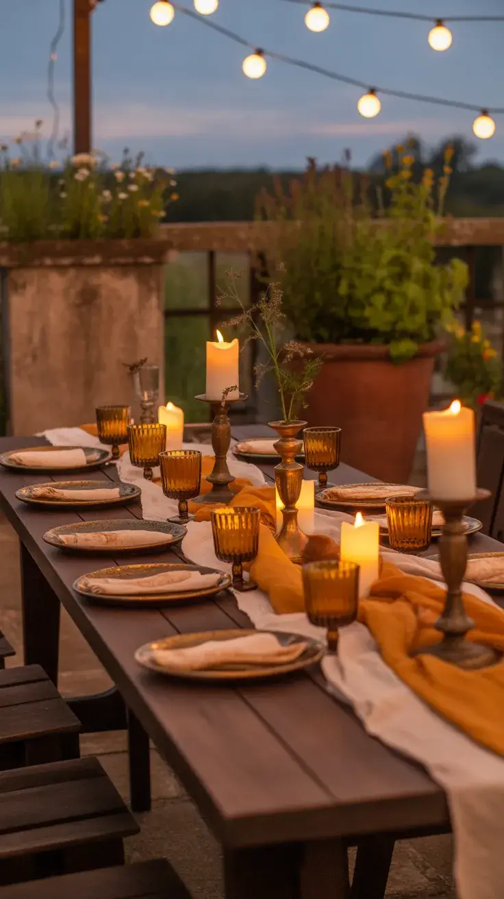
I build this table with warm-toned linens, amber glassware, and layered candles in varying heights. Darker wood furniture enhances the richness, and I often incorporate vintage-inspired pieces for depth. The lighting is everything here, soft, flickering, and slightly dramatic.
I personally love how this setup transforms as the evening progresses. It feels cinematic, almost like an Italian countryside dinner. Many stylists recommend using warm light to flatter both the food and the guests, and I’ve seen firsthand how true that is.
To complete this look, I would ensure there’s enough ambient lighting beyond candles to keep the table functional while maintaining that soft glow.
Blue Gray Table
A Blue and gray palette feels effortlessly modern and slightly coastal without being overly themed. I use this look when I want something refined for an Indoor or semi-Outdoor space that still feels relaxed.
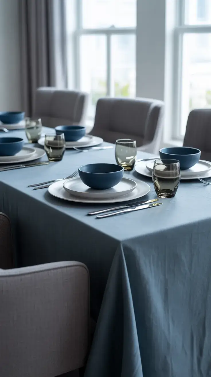
I start with a soft gray tablecloth and layer in Blue and white ceramics. Glassware in smoky tones adds depth, and silver or brushed metal cutlery keeps it polished. Upholstered chairs in neutral fabrics help soften the overall look.
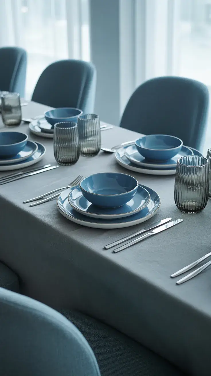
From my perspective, this setup works especially well for mixed-age gatherings because it feels sophisticated but not intimidating. It’s the kind of table that looks styled but still comfortable to sit at for hours.
If I were improving this setup, I would introduce a subtle pop of color, maybe through florals, to break the cool-toned palette slightly.
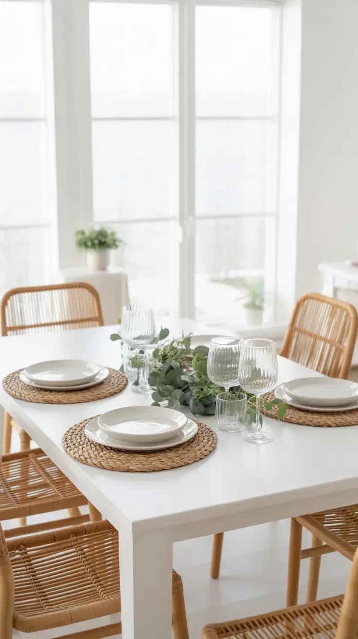
Neutral Linen Table
Neutral linens are my fallback when I want something timeless and Easy to assemble. This look works in almost any Dining room or Outdoor setting and adapts beautifully to different occasions.
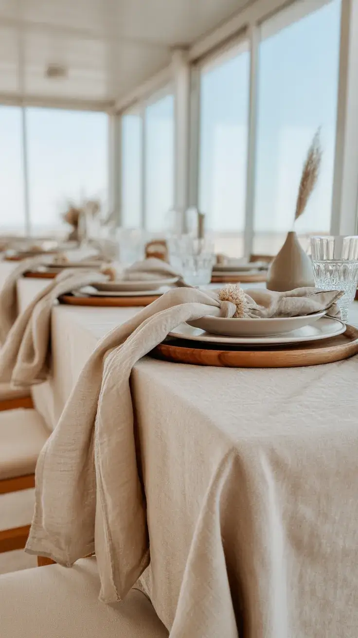
I use layered linen textures in beige, cream, and soft taupe. Plates stay minimal, and I bring in warmth through wooden elements and simple ceramics. The key here is texture rather than color, everything feels soft, tactile, and cohesive.
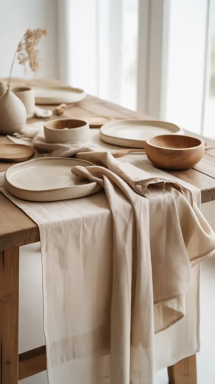
I’ve learned that this style photographs beautifully but, more importantly, it feels calm in real life. Many interior stylists emphasize restraint, and this is where it truly pays off.
To elevate this look further, I would add a focal point centerpiece, perhaps sculptural or floral, to prevent the table from feeling too understated.
Navy Coastal Table
A Coastal table with deep Blue or navy tones brings in that relaxed seaside energy without going overly thematic. I use this especially for summer evenings outdoors or near water.
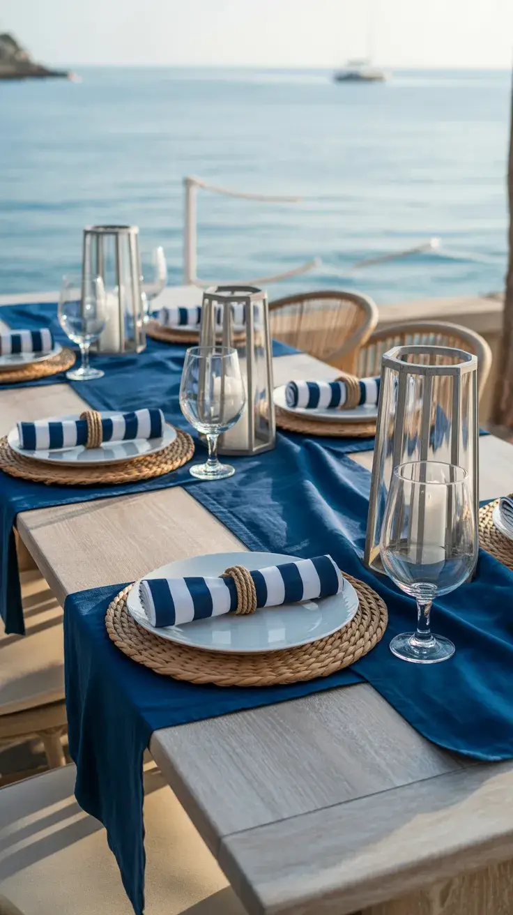
I pair navy linens with striped elements and natural textures like rope or wicker. White plates keep it fresh, and subtle maritime accents, like glass lanterns, add character. The furniture is usually light wood or painted in soft neutrals.
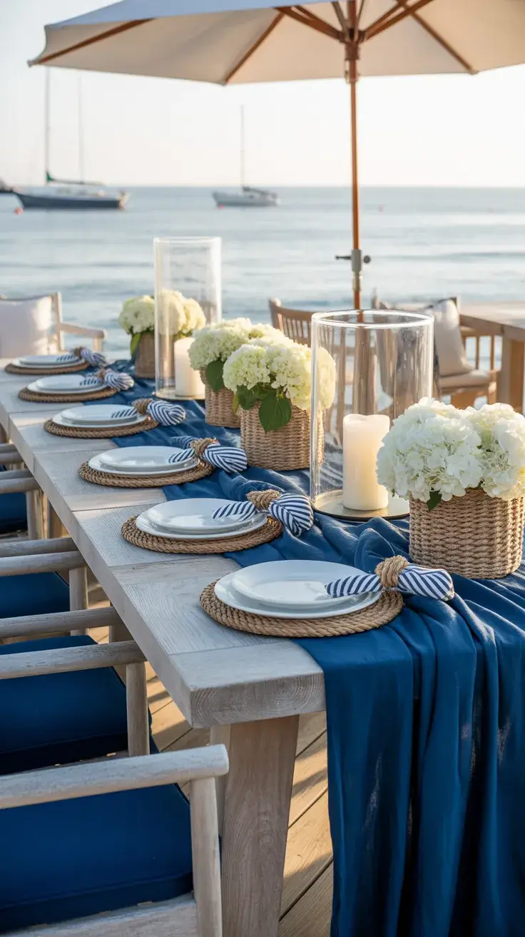
I find this setup incredibly versatile. It feels like a summer in England or along the Mediterranean coast, blending classic and relaxed influences. It’s polished but still welcoming.
If anything is missing, it’s often layering, so I like to add textiles like throws or cushions to create more depth and comfort.
Pastel Wedding Table
For a soft, romantic setup that works even for a Wedding-style dinner party, I turn to pastels. Think soft Pink, muted Green, and delicate tones that feel airy and elegant.
I use light linens, pastel glassware, and floral arrangements that feel loose rather than structured. Chairs are often lighter, sometimes even transparent, to keep the space feeling open. This works beautifully both indoors and outdoors.
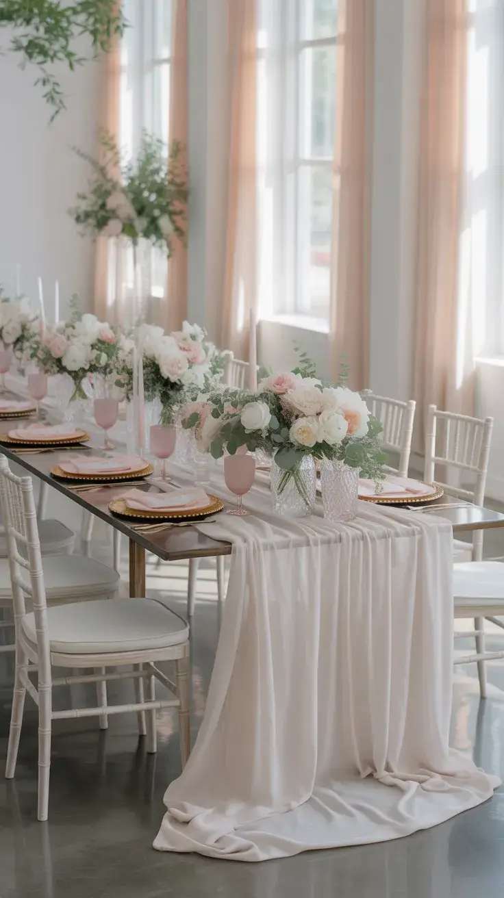
In my experience, this is one of the most photogenic styles. It feels modern but still romantic. Many designers highlight the importance of softness in color transitions, and this palette does exactly that.
To enhance this look, I would focus on layering heights, especially with florals and candles, to create more visual interest across the table.