Wrapping gifts for Christmas doesn’t have to mean wrestling with fussy bows or hunting down the perfect roll of paper. Sometimes the best looks come from a few simple supplies you already have on hand. These 20 easy Christmas wrapping paper ideas prove that a little creativity goes a long way.
From natural cedar clippings to playful cookie cutter embellishments, each approach keeps the focus on thoughtful detail without demanding hours of your time. Whether you lean rustic, modern, or traditional, you will find a style that suits your stack of presents.
Natural Cedar and Glitter Star Accents for Kraft Paper Gifts
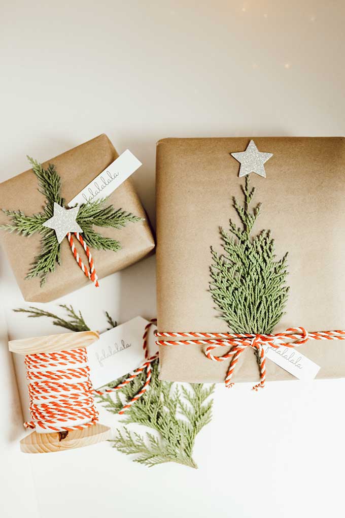
Kraft paper wrapping gets a natural upgrade with cedar branches tucked under twine. The flat lay arrangement keeps the focus on the gifts themselves, with the silver glitter stars adding a hint of shine against the matte brown paper. The cedar branches arranged as small Christmas trees give each package a distinct silhouette without adding bulk. A single sprig of fresh greenery reads as a deliberate accent, not an afterthought.
Cottagecore Charm with Doilies and Dried Oranges
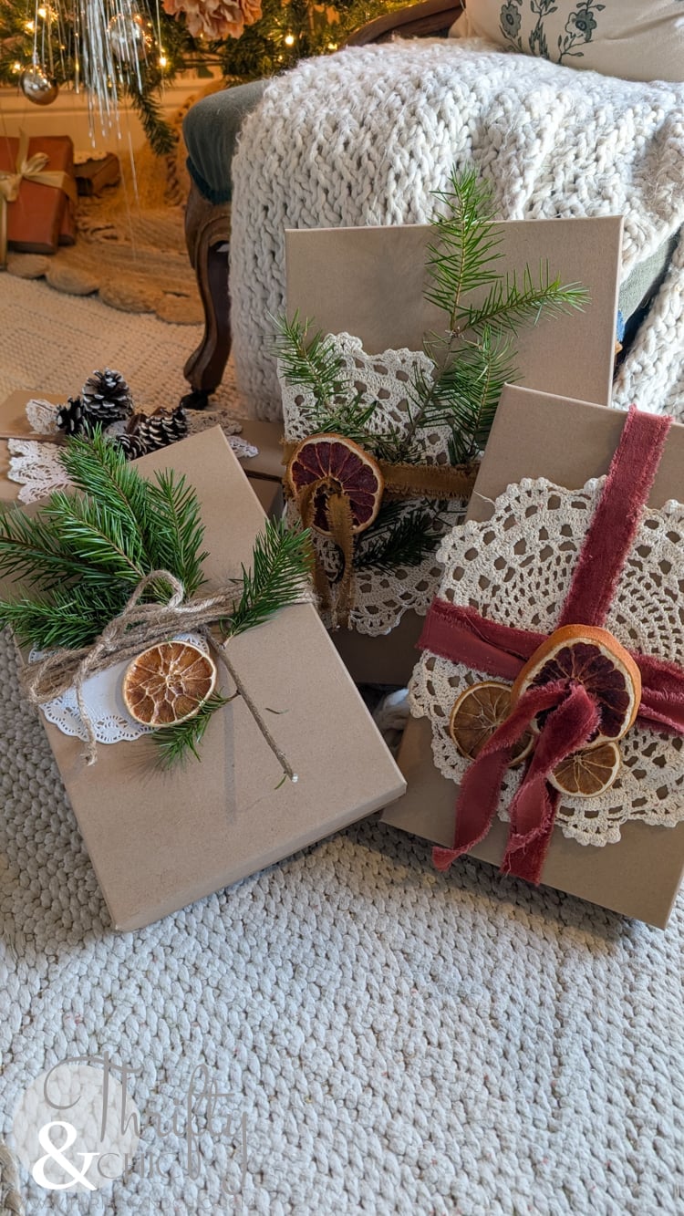
This grouping of gifts leans into a cottagecore palette of cream, brown, green, and red. Doilies and dried orange slices sit on top of the kraft paper, held in place by twine or velvet ribbon. The dried fruit adds a subtle scent and a warm tone that matches the pine tucked between the packages. A practical note: dried citrus slices are lightweight and lie flat, so they do not shift the ribbon or tear the paper underneath.
Festive Mix of Plaid, Floral, and Natural Embellishments

How do you combine plaid, floral, and natural elements without the stack looking chaotic? The answer is a shared palette of red, green, brown, and cream. In this overhead shot, the plaid paper anchors the arrangement, while the floral wrapping adds a softer note. Pine and berries sit across both patterns, tying them together. The compact flat lay means no single gift fights for attention. The natural elements visually connect the different paper patterns, so the whole grouping feels cohesive rather than scattered.
Modern Elegance with Gold Stripes and Minimalist Tags
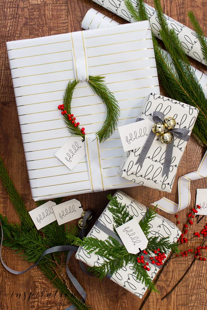
The gold striped wrapping paper is teamed with minimalist tags and a few pine branches. The soft, diffused light keeps the gold from looking brassy and instead gives it a subtle sheen. The tags are plain white or black, letting the stripe pattern do the work. A practical rule: when the paper has a bold geometric pattern, keep the tag design simple so the eye rests on the gift itself.
Classic Burgundy Ribbon and Photo Frame Embellishments
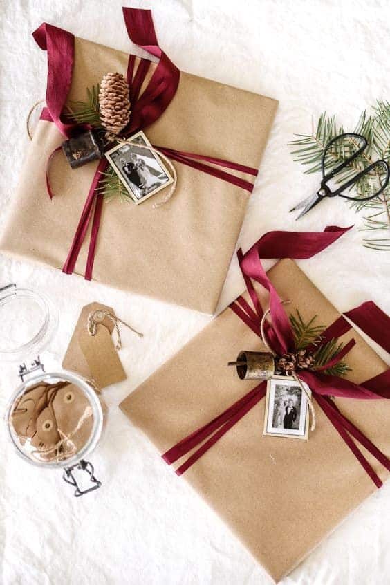
A practical rule for gift wrapping: the ribbon should be the first thing you see, not the paper. Here, a wide burgundy ribbon wraps around kraft paper, with a small photo frame tucked under the bow. The metal frame adds weight and a personal touch without needing extra tape or glue. The pinecone and greenery sit beside the frame, completing the classic palette of brown, burgundy, and green. The ribbon holds everything in place, so the arrangement stays neat as gifts are handed out.
Playful Paper Poinsettias and Button Embellishments
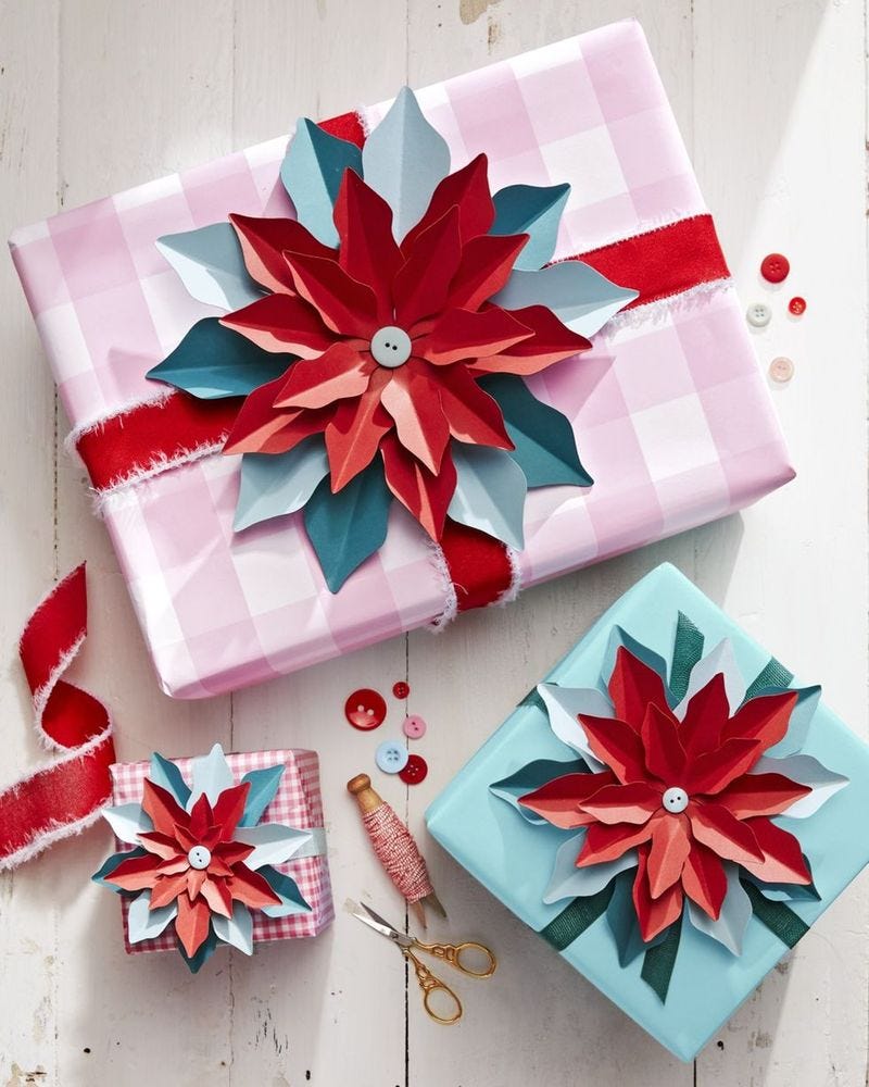
Skip the predictable red and green this year. A playful palette of pink, blue, red, and teal makes the gifts feel more like party decorations than a formal arrangement. Large paper poinsettias become the centerpiece of the flat lay, with buttons scattered around as a cheerful, low-cost accent. The bright, even light keeps the colors crisp without any shadowy corners. What defines this look is the ratio of big to small: one oversized flower per gift, with buttons grouped nearby instead of spread thin. A pair of scissors and a ball of twine sit off to the side, hinting at the handwork without demanding perfection. The style breaks if you try to match every ribbon or button to the paper. Contrast keeps it playful; matching makes it fussy.
Farmhouse Style with Buffalo Check and Wooden Stars
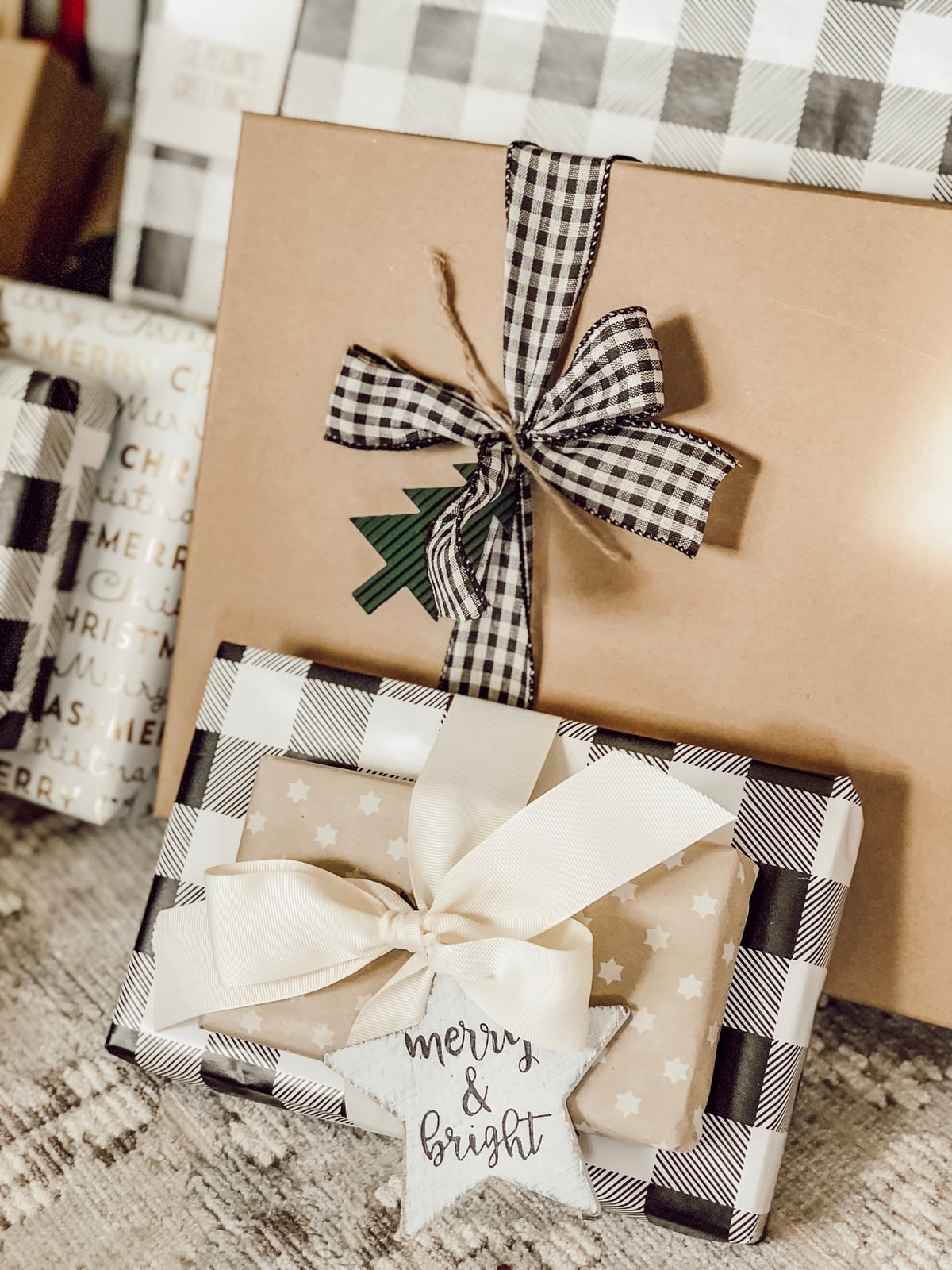
Black and white buffalo check wrapping sets a strong graphic foundation, but the soft, natural light and textured surface underneath add warmth. A wooden star in the same brown-and-cream palette provides a tactile anchor alongside the plaid ribbon. This is farmhouse style with bold pattern balanced by natural materials. The palette defines the look, and a third pattern pulls attention away from the check.
Artistic Hand-Painted Florals and Citrus Motifs
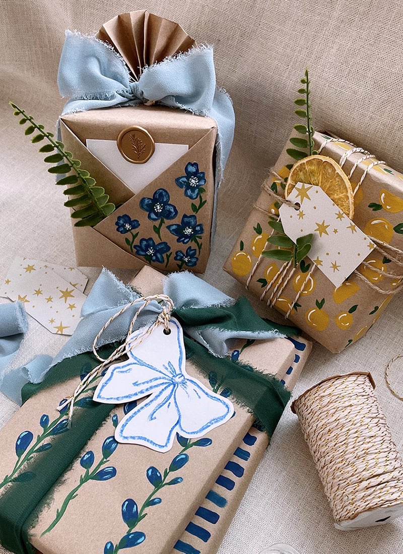
This wrapping reads as a gift in itself. Hand-painted floral and citrus motifs in blue, green, and yellow turn plain kraft paper into something personal, with a dried orange slice and a fern sprig tied on with twine. The soft studio light flattens shadows so the brushwork stays readable rather than glossy. The palette is the anchor: warm browns from the paper and orange slice against cool blues and greens keeps the eye moving. A metallic ribbon or a shiny tag would compete with the matte, hand-done feel.
Modern Rustic Painted Designs on Kraft Paper
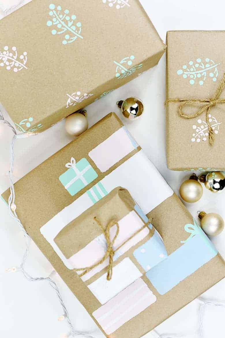
Can kraft paper hold up to a painted design without looking like a school project? Yes, when the palette stays soft. Pastel blue, pink, and mint green on brown paper keeps the rustic base while pushing the look toward modern. The flat lay arrangement in soft, natural light lets the painted shapes breathe without glare. What defines this style is the contrast between the raw kraft texture and the deliberate, clean-edged paint. The ratio is about three parts paper to one part paint, leaving most of the surface exposed. The look breaks if the paint covers too much area, which makes the paper feel like a canvas instead of a wrapper.
Minimalist Style with Cookie Cutter Embellishments
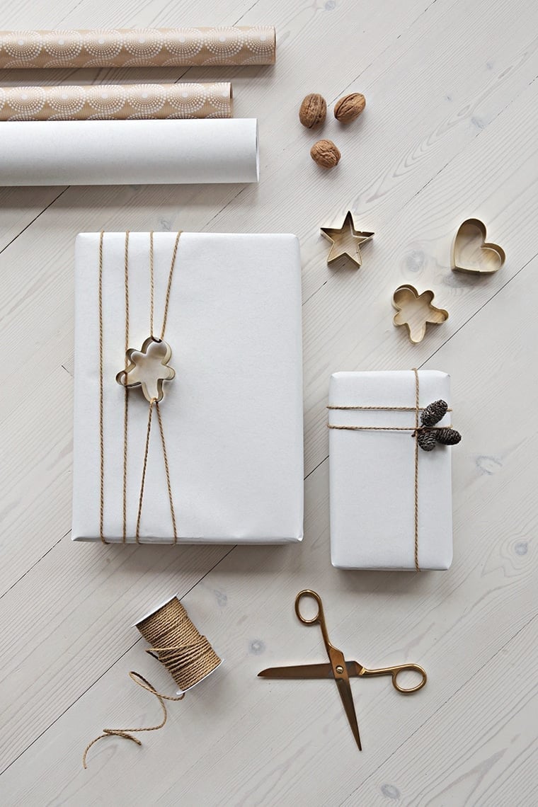
A gingerbread man cookie cutter on white paper with twine is a concrete fact of this design: the metal shape sits directly on the wrapped gift, not tied or glued. The soft, natural light keeps the white paper from looking clinical. This is minimalist style where the embellishment does double duty. The wooden twine and brown cookie cutter provide the only color, so the palette stays clean. Adding more than one shape per gift or using a cutter that is too small to read from a few feet away disrupts the look.
Whimsical Animal Patterns with Red Ribbon and Baubles
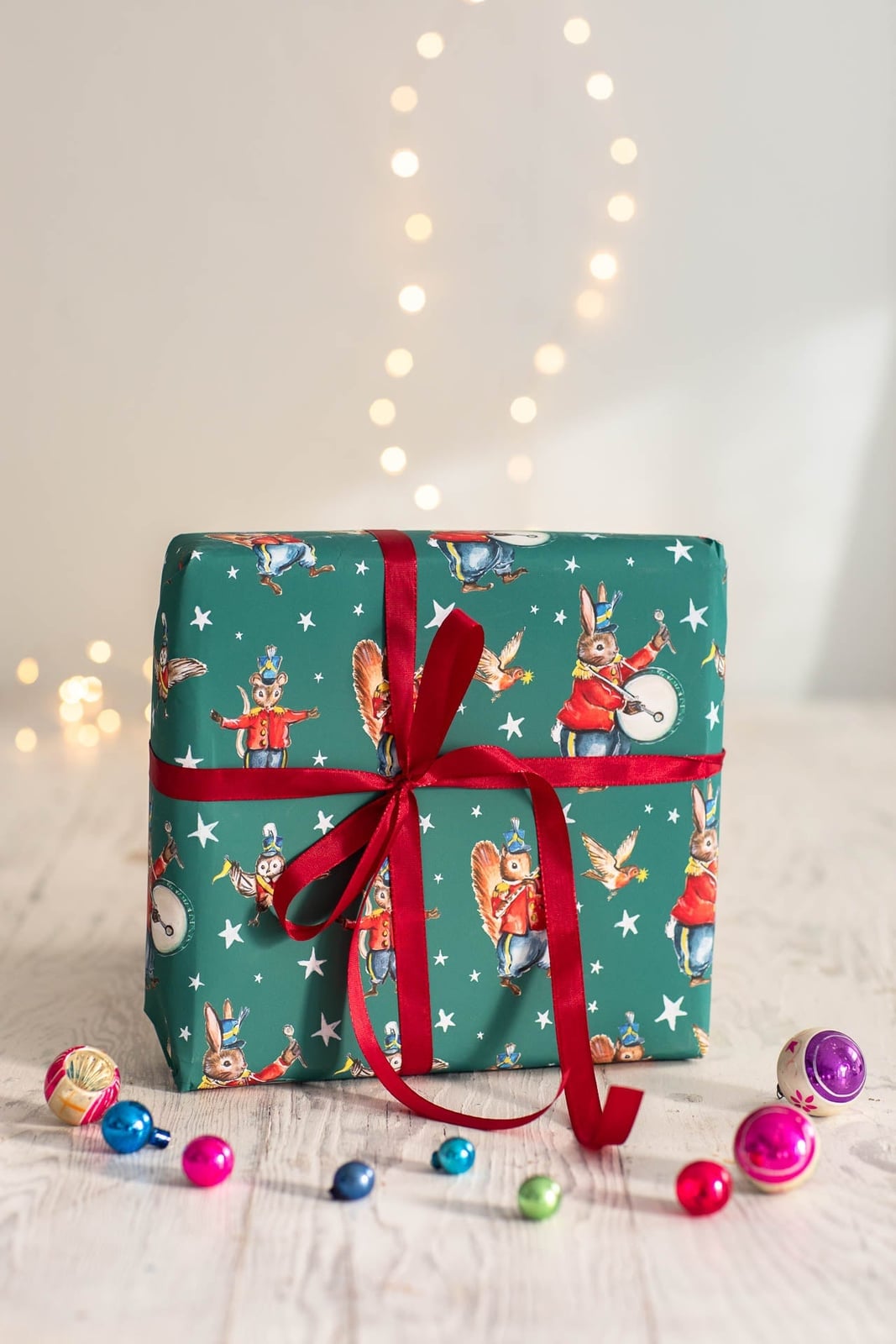
When a gift wrap works best, it uses contrast to keep the eye moving. Here the whimsical animal pattern on the paper provides the personality, while the red ribbon and baubles add structure. The palette stays green, red, and white, which is festive without feeling busy. Let the paper pattern lead, then keep the ribbon and baubles in a single accent color. That way the gift feels playful but not chaotic. The soft overhead lighting and ambient string lights help the baubles catch the eye. It is a style that works well for a child’s gift or a casual family gathering where the goal is fun.
Woodland Creature Illustrations with Greenery and Beads
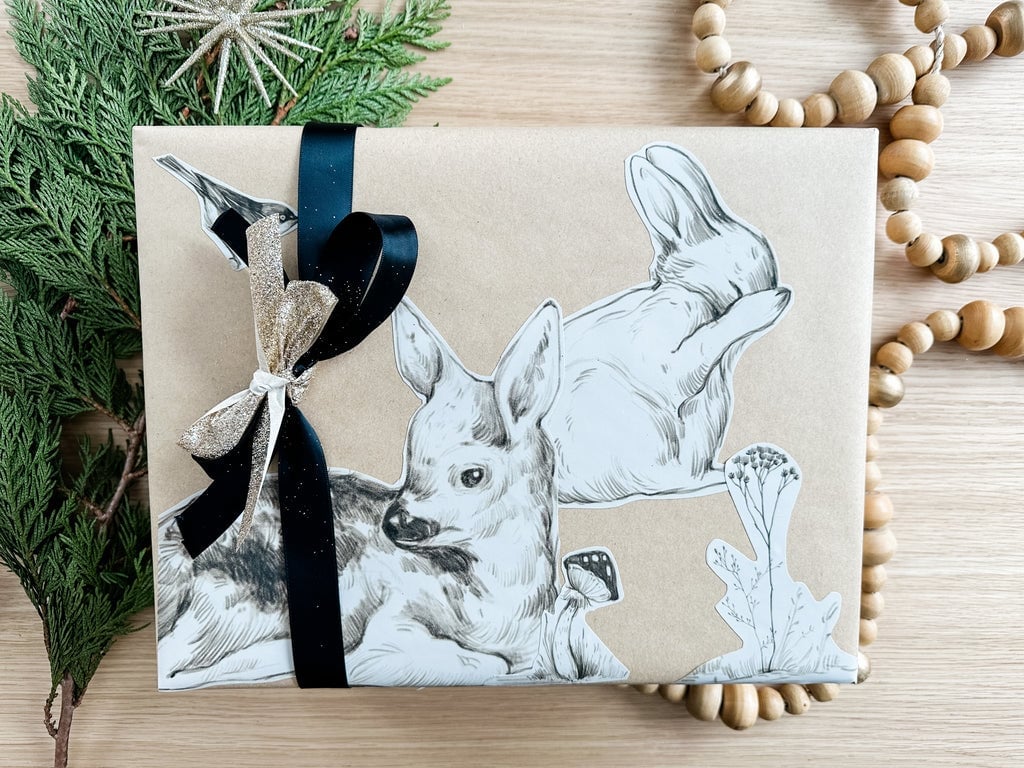
This look leans into a natural festive style. The palette mixes brown, black, gold, and green, which gives it an earthy but refined feel. The illustrated woodland creatures on the paper set the tone, and the greenery and wood beads reinforce the outdoor theme without making the gift feel heavy. The ratio of natural elements to paper is balanced: the greenery sits lightly on top, and the beads add texture. What breaks this look is adding anything glossy or metallic that pulls attention away from the paper’s hand-drawn quality. The soft natural light keeps the gift feeling quiet, which suits a gift for someone who appreciates nature or handmade details.
Traditional Red and White Patterns with Holly Accents

The red and white patterned paper anchors this gift in a classic holiday look, and the holly sprigs and twine add a natural counterpoint. The palette keeps red, white, brown, and green, which reads as traditional without going full vintage. The pine sprigs break up the repeating pattern on the paper, giving the eye a place to rest. A practical rule: when the paper has a strong geometric repeat, keep the embellishments organic to avoid visual noise. The soft natural light helps the red feel rich and the white feel crisp. This setup works for a gift that needs to feel timeless, like one for a parent or a host.
Rustic Charm with Red Ribbon and Berry Accents
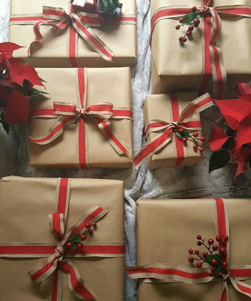
This is a straightforward rustic look that relies on contrast. The brown paper provides a neutral base, and the red ribbon and berry accents add a pop of color that feels natural rather than artificial. The poinsettias reinforce the seasonal feel without overwhelming the gift. A clear one-line assessment: this works because the red stays concentrated on the ribbon and berries, so the brown paper has room to breathe. The soft natural light keeps the berries looking fresh and the ribbon looking crisp. This style suits a gift for a friend or neighbor where the goal is warmth and simplicity rather than elaborate decoration.
Modern Rustic Supplies: Stripes, Polka Dots, and Pinecones
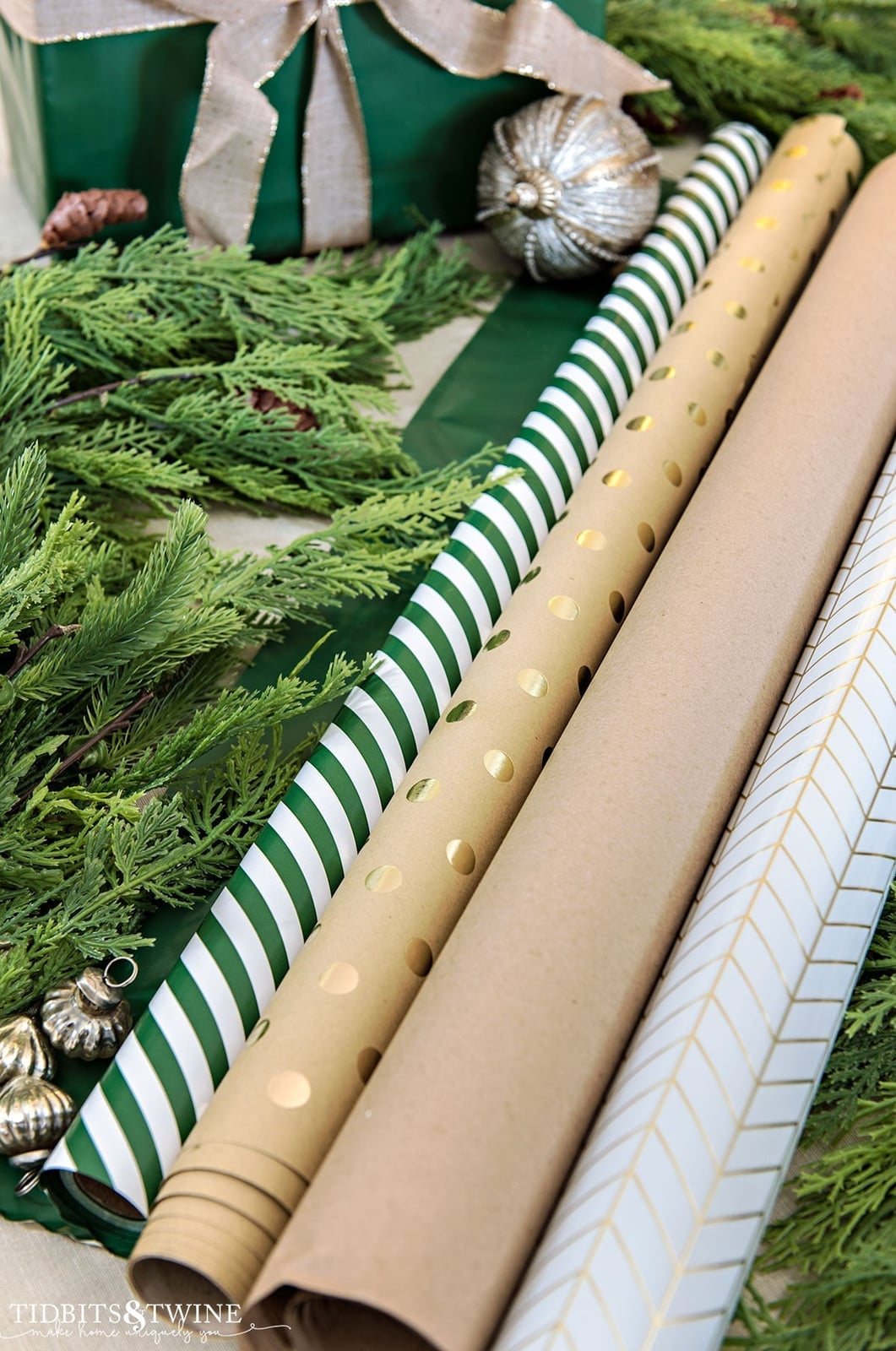
How do you store wrapping paper rolls without them taking over the room? A flat lay of supplies is a practical way to see what you have before you start wrapping. Here the rolls include stripes, polka dots, and kraft brown paper, with pinecones and evergreen sprigs scattered in for seasonal texture. The palette mixes green, gold, kraft brown, and white, which reads as modern rustic. A useful tip: group rolls by pattern type so you can grab a base paper and a contrasting ribbon without digging through a pile. The soft natural light helps the gold accents stand out without feeling harsh. This setup works for someone who likes to mix patterns but wants to keep the process organized and the result cohesive.
Elegant Black and Gold with Glittery Snowflake Ornaments
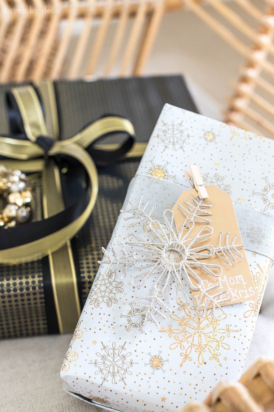
A dark paper base makes metallic accents stand out. Black wrapping paired with a gold ribbon and a single silver snowflake ornament creates a palette that feels formal without needing a full set of matching accessories. The gift tag stays minimal, often a plain white card or a small gold foil label, so the ornament carries the focal weight. This is a style where restraint defines the look: one glittery detail per gift keeps the arrangement cohesive when several presents sit together. Adding too many textures muddles the contrast between matte black and metallic shine.
Traditional Festive Metallic Gold and Striped Papers
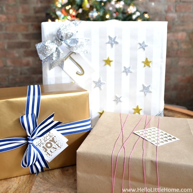
To mix patterns, anchor them with a solid tone. A metallic gold gift sits beside a blue and white striped one, both tied with ribbon and topped with ornate tags that echo the gold accent. The compact grouping on a tabletop keeps the palette from feeling scattered because the brown kraft paper underneath provides a neutral base. The combination works because the stripes add movement while the metallic surface reflects light, giving the arrangement depth without competing. The palette uses cool tones with a warm metallic pop, which looks festive but not childish. Introducing a third pattern that does not share a color from the existing pair would break the look.
Cozy Traditional Christmas with Gingerbread Cookies
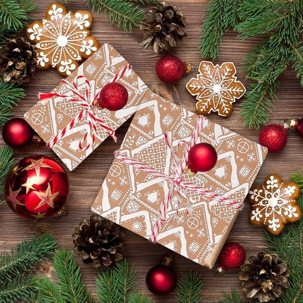
This look sits between a rustic cookie display and a formal gift arrangement, and the difference lies in the materials. The wrapped gifts use brown paper and red ribbon, a classic base, but the addition of gingerbread snowflake cookies, pine branches, and glass ornaments shifts the feel toward edible decor. The flat lay composition centers the presents while the cookies and greenery scatter around them, creating a casual, abundant look that suits a table setting.
The style relies on natural and handmade elements. The wood surface and fresh pine feel organic, while the gingerbread introduces a homemade texture that softens the formality of the ribbon. The palette stays warm with brown, white, red, and green, all tones that appear in both the gifts and the food. Using plastic-wrapped store cookies instead of homemade ones changes the texture and the visual weight of the arrangement.
Crafty Yarn-Wrapped Christmas Tree Design
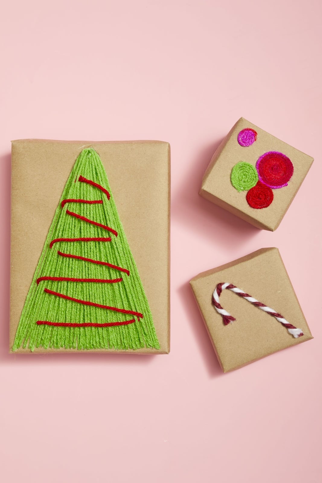
A yarn Christmas tree drawn directly onto kraft paper gives a handmade feel that printed wrapping cannot match. The design uses green yarn to form the tree shape, with a brown trunk and small red and pink accents that act as ornaments. The gifts sit on a pink surface, which softens the brown paper and makes the yarn colors stand out. This style relies on the texture of the yarn itself, so the wrapping feels dimensional even from a distance. The layout works best when the yarn tree sits centered on the package, with the string ends tucked neatly underneath to keep the silhouette clean. Using yarn that frays or comes in a shade too close to the paper color makes the tree shape hard to read.
Modern Festive Bold Red and White Patterns
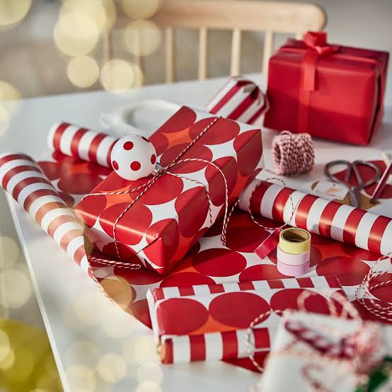
Bold red and white patterns give this wrapping a graphic quality that feels modern. The medium shot shows wrapped gifts alongside rolls of paper in matching patterns, plus twine, scissors, and tape on a tabletop. The palette includes orange and pink accents that prevent the red and white from feeling flat, and the ambient light with a bokeh background keeps the scene from looking too crisp or commercial. The scale of the pattern matters: large stripes or wide polka dots work better on bigger gifts, while small-scale prints suit narrow boxes. Pairing a bold pattern with another pattern of equal visual weight creates competition instead of complement. A solid ribbon or plain twine gives the eye a place to rest.
Final Thoughts
A little effort on the outside shows care for what is inside. The best wrapping does not need to be complicated. A sprig of greenery, a strip of ribbon, or a simple hand-painted motif can turn plain paper into something memorable. Stick with materials that feel like you and your holiday. Keep a stash of kraft paper, twine, and a few natural accents handy, and you will be ready for last-minute gifts. Let the wrapping be part of the giving, not a chore you rush through. That is the real gift.